
Free Duct Tape
Watercolor and ink on paper
5.5" x 8.5"
It just came out this way.
Free Duct Tape
Watercolor and ink on paper
5.5" x 8.5"
It just came out this way.

Beekeeper + Shaman
Mixed media
5.5" x 8.5"

I Did Not See That Coming
Mixed media
5.5" x 8.5"

Pleased to Feet You
Mixed media
5.5" x 8.5"
These first few came from a class I took this summer, called "Smashbooks and Visual Arts Journals Blah Blah and Et Cetera", or something like that. We made our own sketchbooks, and these are a few of the pages from it. It was a great class, and I made a ton of crazy collages with laser eyes and mouths, vomit, and blood. Needless to say, fun was had by all who attended!
I will definitely have my Drawing & Painting students make their own sketchbooks this year. I think it's a great way for them to get excited about making art and tap into their right brain, not-thinking thoughts.

Brands Mean Nothing to Me
Watercolor on paper
6" x 9"

The Last Immigrant Grocer on Earth
Watercolor on paper
5.5" x 8.5"

There's a Riot Goin' on
Watercolor on paper
6" x 9"
These next three came from the afore-mentioned watercolor class, in which I loosened up a little and made a series of slightly Diebenkorn-y, non-representational jobbers.

Framed Tree No. 1
Watercolor on paper
5" x 8"

Framed Tree No. 2
Watercolor on paper
6" x 9"
And lastly, the trees come from the watercolor class, too. They use the "blown straw" technique to create the trees, with details added later. The first one already had a rectangle on the page when I started, so I left it in as a design element and did a few more like it. I have a couple of others in this series, and I might add them later if I get a chance.
Enjoy!

last week, i completed and mailed out my sketchbook (see a sample page above) to art house co-op in atlanta for their sketchbook project, which will be coming to a city near (or possibly quite far from) you! click here for exhibition locations and dates, and click over here to see more pages from my book.
and this just in-->the above sketch is in the process of becoming a painting, which you can see below, in sneak preview:
click image for a closer look
click image for a closer look
click image for a closer look
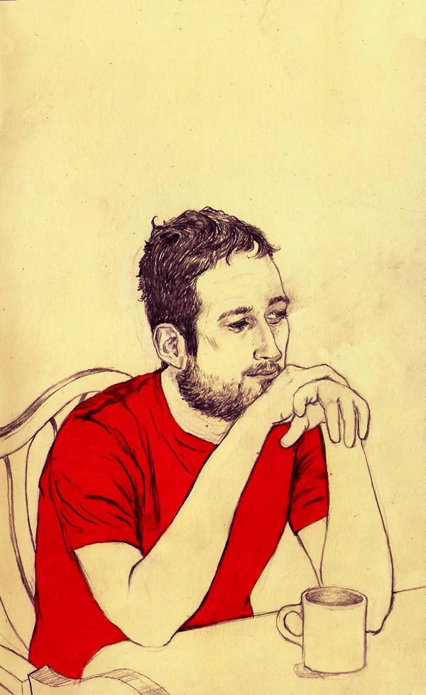
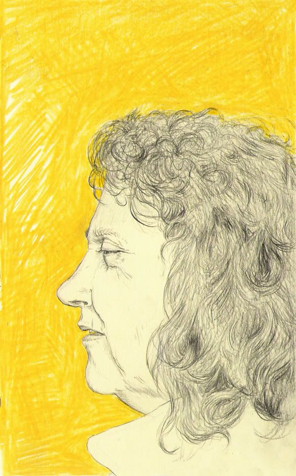
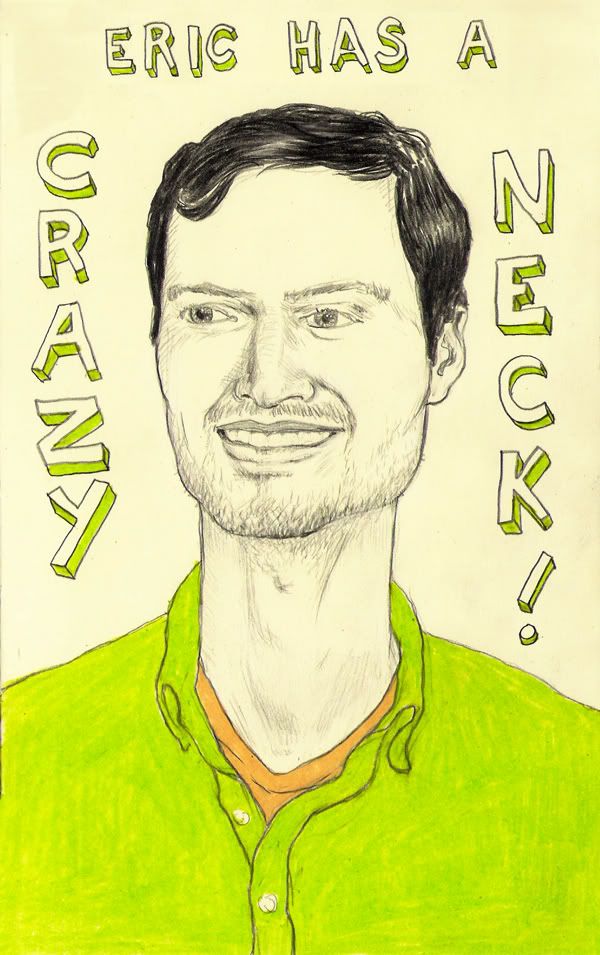
Ryan, Jo Ann, and Eric P.
graphite and colored pencil on paper
each 5" x 8"
here are three drawings i did today while on hall duty. for the record, eric's neck is not really like that in real life.

David Cross
graphite on paper with digital coloring, 5" x 8"
i finally colored my portrait of david cross! it was actually the first celebrity drawing i ever did (in 2007? i forget), back when i was only going to draw celebs i had seen in person. of course, now that i live in speonk, that happens less often--although the jules and i did see rachel weisz at an art reception in the hamptons a couple of weeks ago. we were (briefly) listening to some crap band that the geezers were calling "punk", when we realized that ms. weisz was standing right behind us. when we went back into the gallery, she sort of followed us around for a while. embarrassing, really.
click image for a closer look
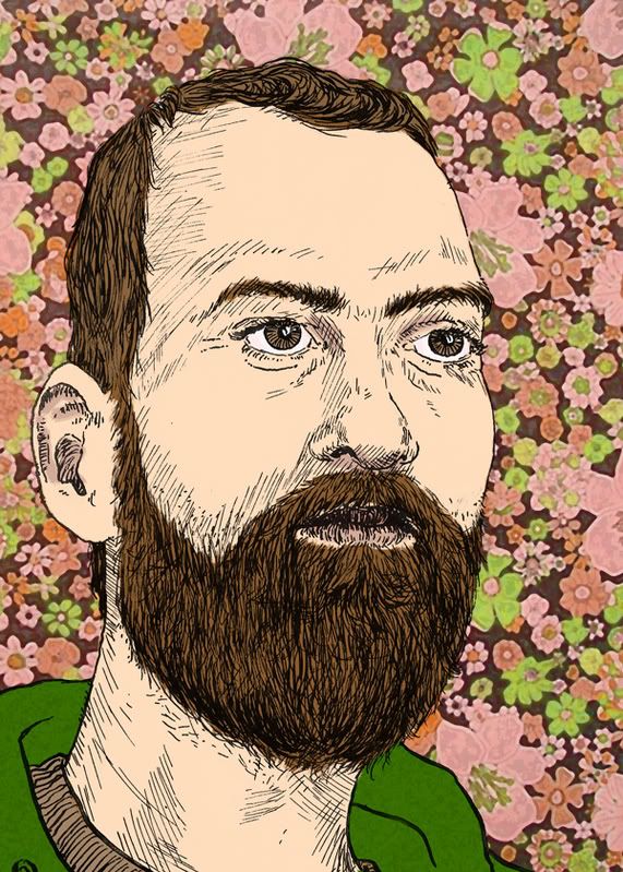
Self Portrait with Floral Motif
pen and ink on paper with digital coloring, 5" x 7"
here is a self portrait i made recently. the first version is a simple pen and ink drawing, without the color bits. i made it for my friend mike freiheit's new project, in which he is enlisting several artists to do portraits of jesus. my first sketches were of a truly semitic jesus, as opposed to the anglo-jesuses we see here in the west. but then, while i was working, i happened to see my reflection in a window, and thought, "hey my beard is looking jesusy, i have a shorter haircut (which my research had revealed would probably be more accurate), and i happen to be 33 years old right now. also, i was wearing a hooded sweatshirt at that moment, and i figured it would be a good stand-in for a shepherd's robe of some sort. and maybe it could be read in a "jesus is in all of us" sort of way, as well. i certainly do not mean to say that i am the messiah or anything, so don't look to me for salvation or anything--i'm fresh out at the moment.
click image for a closer look
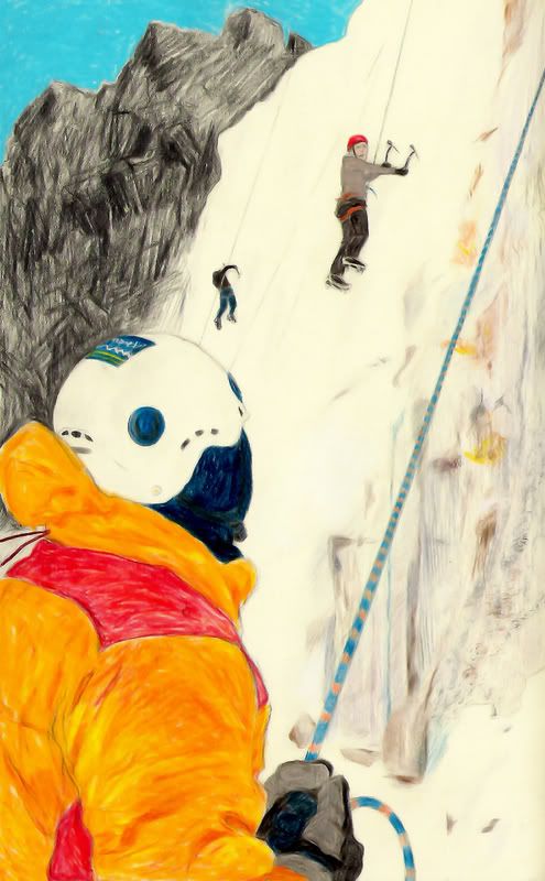
it's been a while since i've put up anything with scenery. i love doing the portraits, but every now and then i need a change of pace, you know? this drawing was inspired by a photo i came across on the adventure 16 blog, which you can see here.
i'm still working mainly in colored pencil, but lately i've been throwing in a few change-ups here and there (more liberal use of graphite, pen and ink, digital manipulations, etc.)
i've really been pushing to get commissions as of late, putting myself out there as much as i can. i joined hireanillustrator.com, spraygraphic.com, stars-portraits.com, and so forth, in hopes that the right person is going to discover me soon. grad school ain't gonna pay for itself, folks!
click image for a closer look
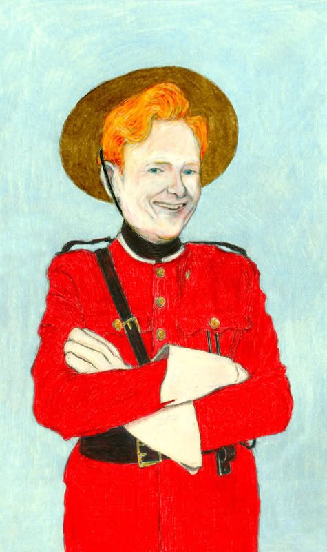
here's conan o'brien, in his royal canadian mounted police uniform, from the week he did the show in toronto. i loved the look of the white gloves against the red jacket, though i think the real guys usually wear brown gloves for the most part.
i did something a little different this time, using black and red ink in the belt and jacket areas. i used the ink for the base layer, then added colored pencil over it. it really makes the color all bursty, don't you think?
click image for a closer look
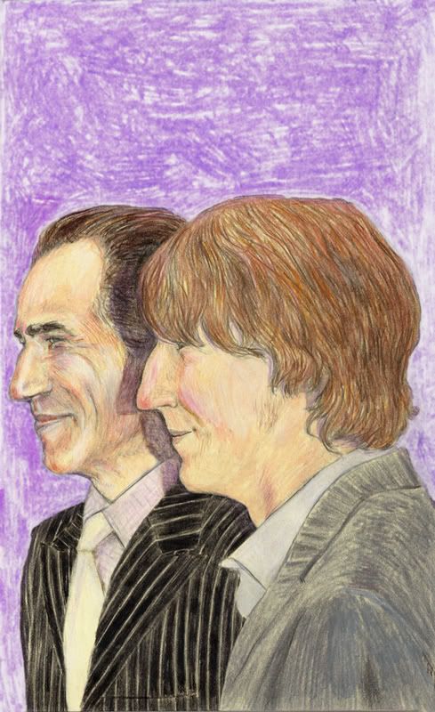
here's a fairly new one of daniel day-lewis and paul dano, stars of there will be blood. i just saw mr. dano as dwayne in little miss sunshine last night, too. i'd seen it before, but it came on television last night, so i saw it again.
julia and i had been away from home for 12 days until we finally arrived got back yesterday morning. we had intended to get a lot of work done this weekend, but when we got here, we found that we didn't want to do a thing except vegetate on the couch. we ended up watching three movies in all, so i feel like we accomplished something, no?
click image for a closer look
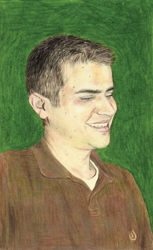
"it's a long, long roadso if you didn't get the reference there, this my little brother eric. when he was a baby and i a wee young lad with a speech impediment, i called him "egget".
he recently went back to college (neither of us made it through the first time). he's really giving it a go, i must say--making straight A's this time around. actually, nothing lower than a 99 so far!
yeah. that's how we roll.

click image for a closer look
"is solace anywhere more comforting than in the arms of a sister?"
-alice walker
and here we see emily and julia, two of the four brandt sisters, on top of a mountain.
i often wonder if the world would be a better place if all the men in positions of authority would just step down and let women run things for a while. something makes me think that there would be far less bombing and lots more hugs.
ladies: don't invite sarah palin, though. that would defeat the purpose.
click image for a closer look
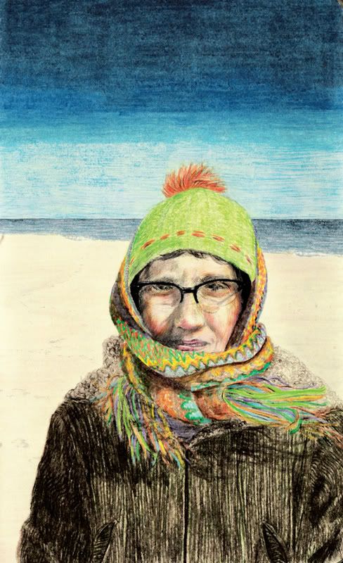
here's julia again, on the beach in winter. we love going to the beach in the off season, when no one else is around. not that we don't like you or anything, but we need our space sometimes, you know?
thanks for understanding.
hang on. obama's victory speech is starting...
...aaaand that was the first time that a politician's speech has ever made me cry. what can i say? the man's got skills.
click image for a closer look
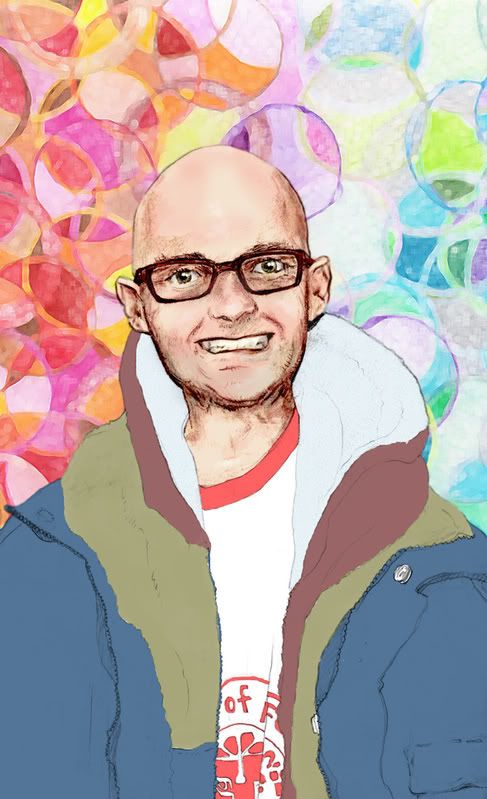
so we're back to celebrities whom i've seen in person. i saw moby back when i worked at a record store on st. marks place. he came in the store, soon realized that it was crappy, and left. i don't really listen to his music, but i do admire that he is a famous person who actually uses his wealth to help the planet. so i found this picture of him that i drew months ago in my old sketchbook, and saw that i had never colored or posted it. so i, um, colored and posted it.
i think the captain's face came out better (both were colored in photoshop, which i've been practicing), but i really like the background on this one. i used a crayon drawing i had done in my "art in elementary education" class. yay crayola!
click image for a closer look
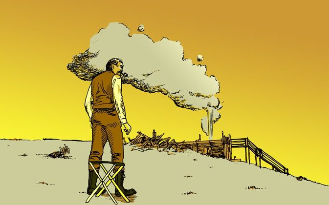
one of my favorite scenes from "there will be blood" is the one when the derrick blows up and the men are silhouetted against the backdrop of a giant wall of fire. definitely a top 5 movie for me. daniel day-lewis can pretty much do no wrong. he took several years off from acting to make shoes, for pete's sake! how awesome is that?
i would like to have a pair of those shoes, btw, if anyone ever sees them on ebay or something.

click image for a closer look
so here you go. i decided to try coloring in photoshop (see previous post). s'okay. i think i learned a few things, anyhoo.
click image for a closer look
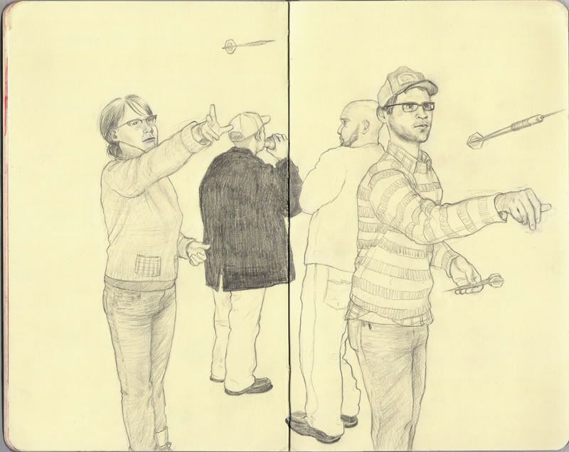
also, we took turns. i decided to blend two photos together to make one image, because i liked the variation of the arm positions. julia's mid-air dart is actually visible in the original photo(!), but i had to make up the one that i'm throwing. i'm trying to decide whether i should draw in the bar/background, add color, or just leave it alone.
i've actually been toying with coloring it in photoshop, which could be good or bad. since i'm kind of self-taught in that arena, i don't really know (or maybe remember is the better word) the "proper" way to color in photoshop. i've just sort of experimented my way through the features, for the most part. it might be interesting to see how it would turn out.
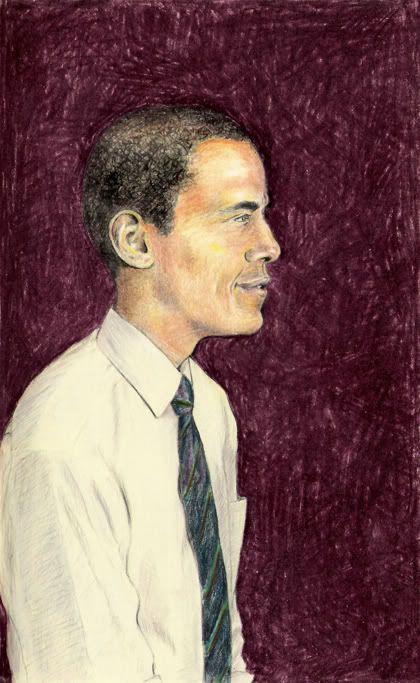
i made this drawing into a t-shirt! you can buy it here.
i swear, if he doesn't win...let's just say i might want to make a loooong visit to another country.
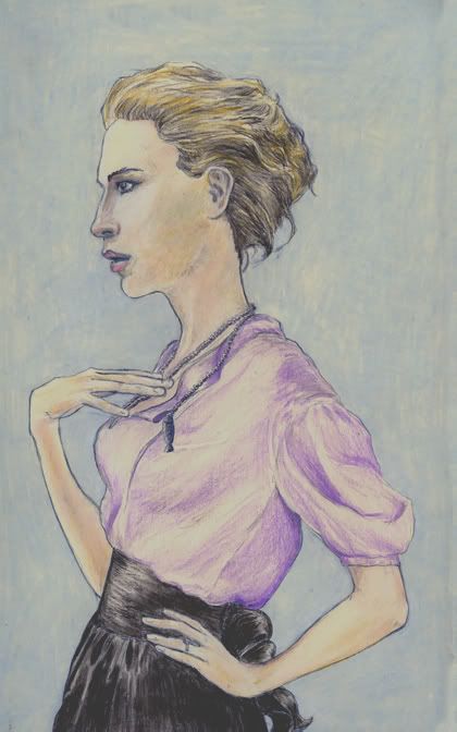
i always liked cate blanchett, but i was truly blown away by her portrayal of dylan in i'm not there. the people with whom i saw the movie were not impressed with the film all that much, but i thought it was a unique way to explore the life of one unique individual. the only drawback in my eyes was that in using so many actors to play one character, the viewers inevitably choose a favorite, which causes them to like the other versions less. and the other actors were certainly left in the dust by dear cate here.
i wanted to do a picture of her as dylan(or "jude," as her version of dylan is named), but didn't find a decently-sized photo that i liked enough. so i went with a glamour shot, and i'm pretty happy with how it came out. she certainly inspired a nice, subtle palette, i think.
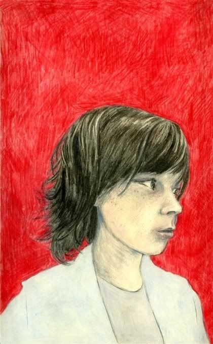
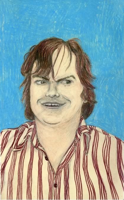
and that was miss parker posey, whom i ran across during my former incarnation as a hipster-east-village-record-store-employee. see this post for more info.
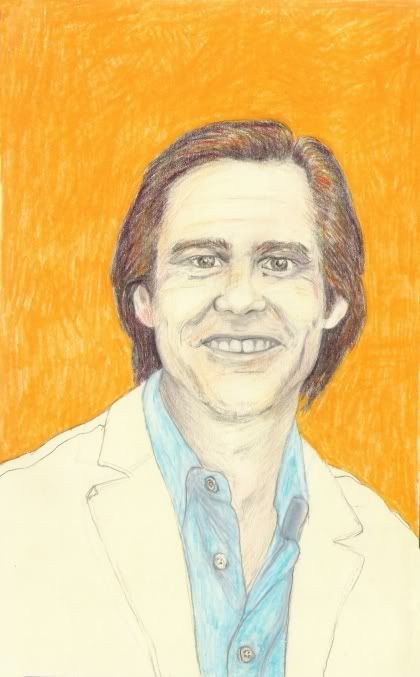
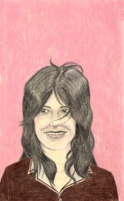
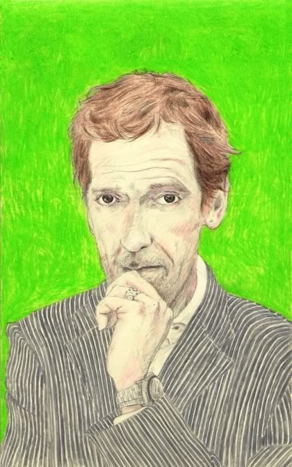
of the five portraits you see here, i am particularly proud of the bjork and the hugh laurie. i'm not quite as satisfied with the jack and the jim, but i do feel like i'm generally starting to get my speed and accuracy up to levels i'm comfortable with.
ooh, when i typed the word "satisfied" just now, that exact word was mentioned in the song that was playing. that song owes me a coke!
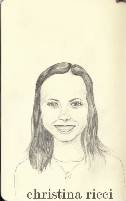
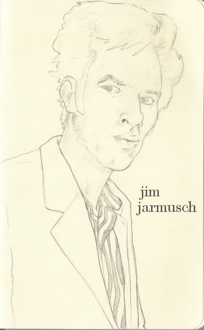
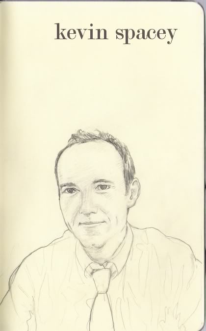
here are some more celebrities i've seen in person. see my previous post for an explanation of why i'm drawing them.
attention, lady celebrities: i need to see more of you in person (no, i mean a larger number of you). my list is a little dude-heavy. wait, does '80s rocker sebastian bach count as a guy or a girl?

